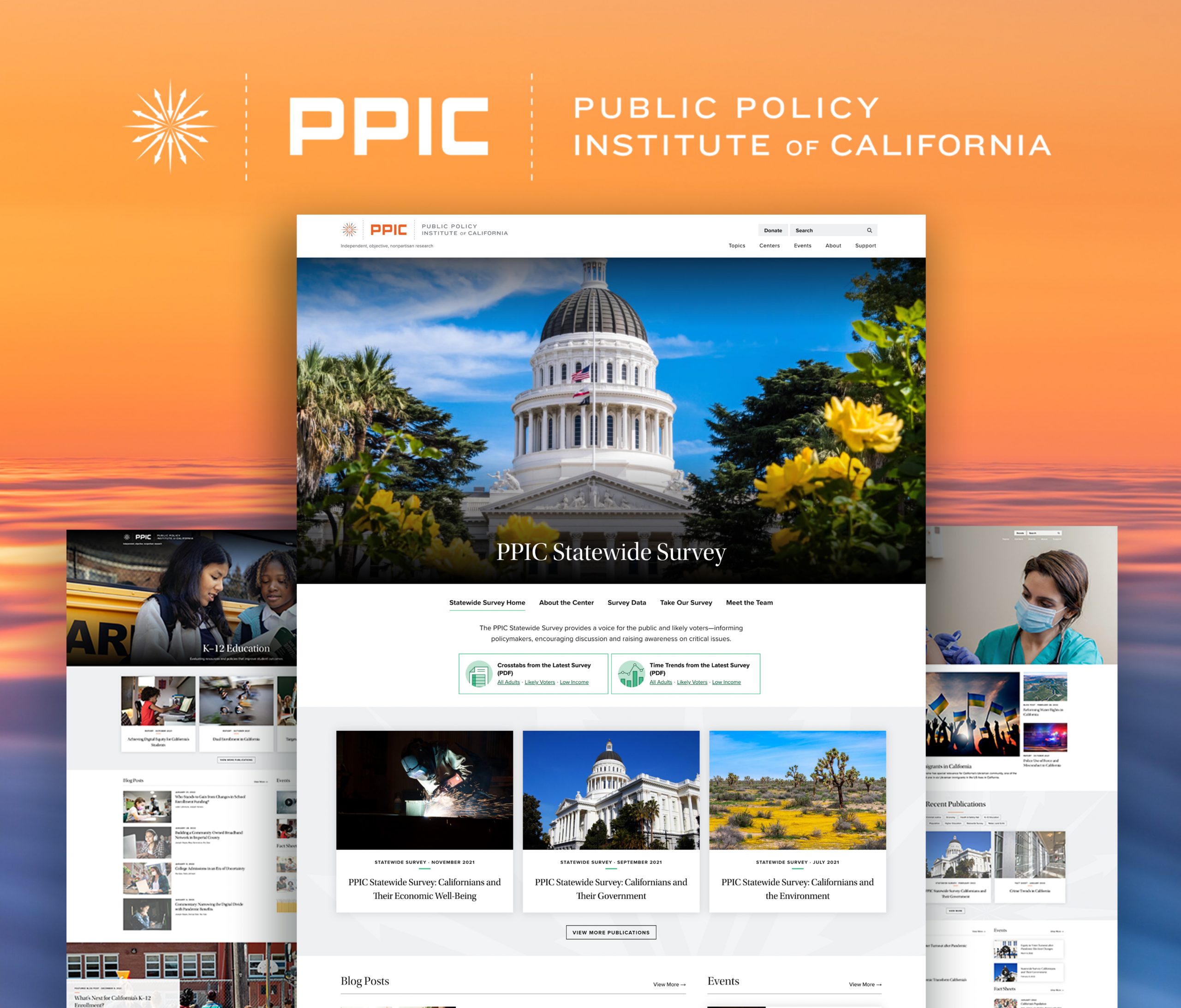
Public Policy Institute of California
A leading think tank rethinks what it means to inform the public.
- Strategy |
- Design |
- Development
The
Challenge
To fulfill its mission of accessibility, a leading think tank aspires to reach more than academics and policymakers.
The
Journey
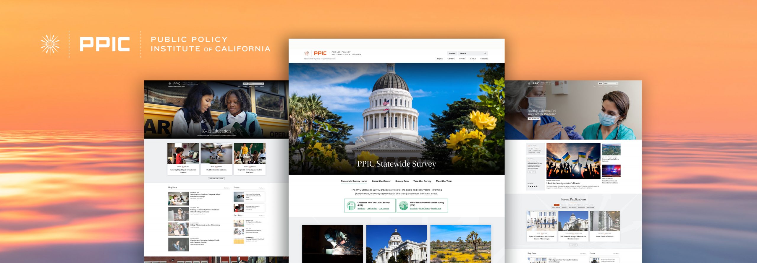
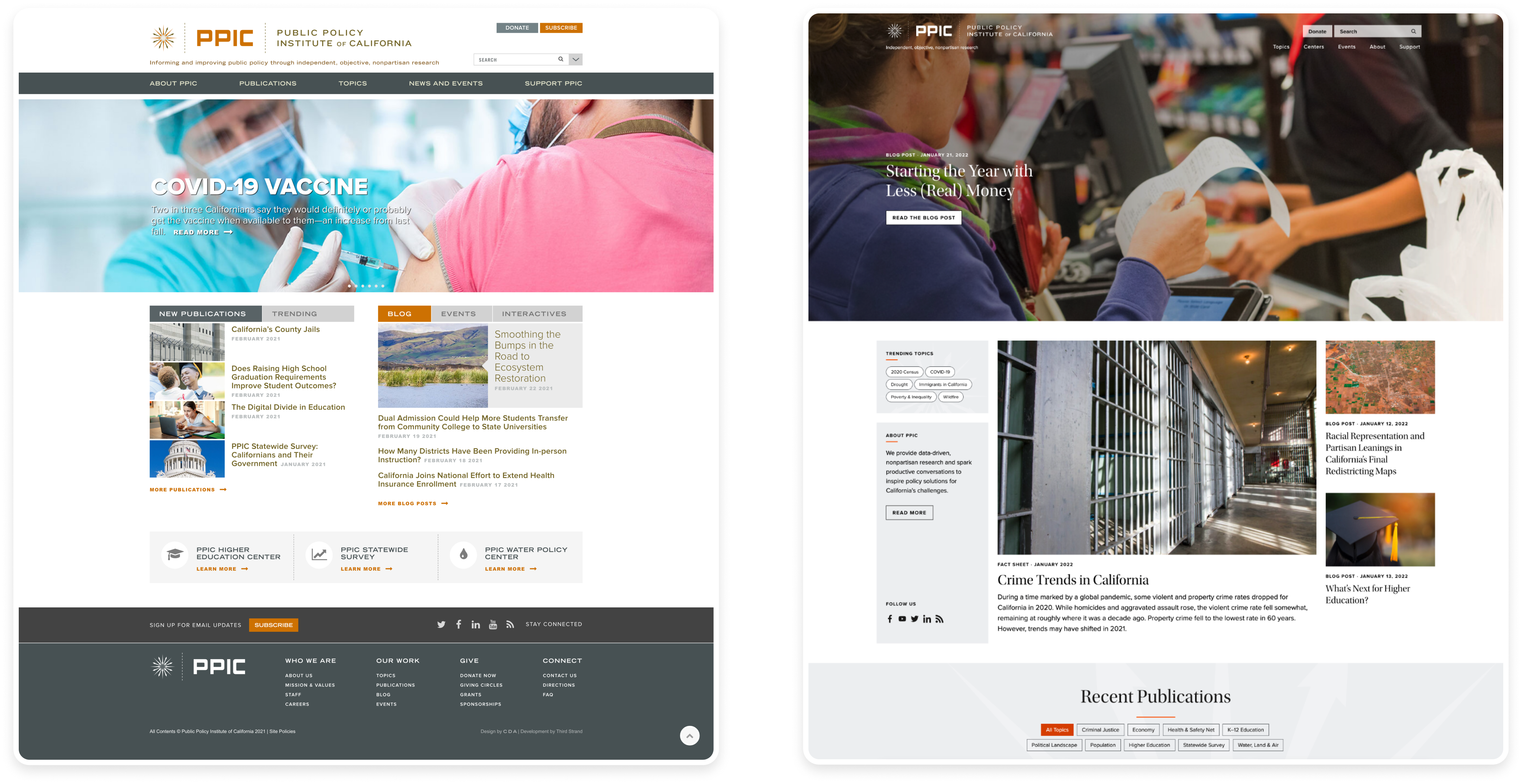
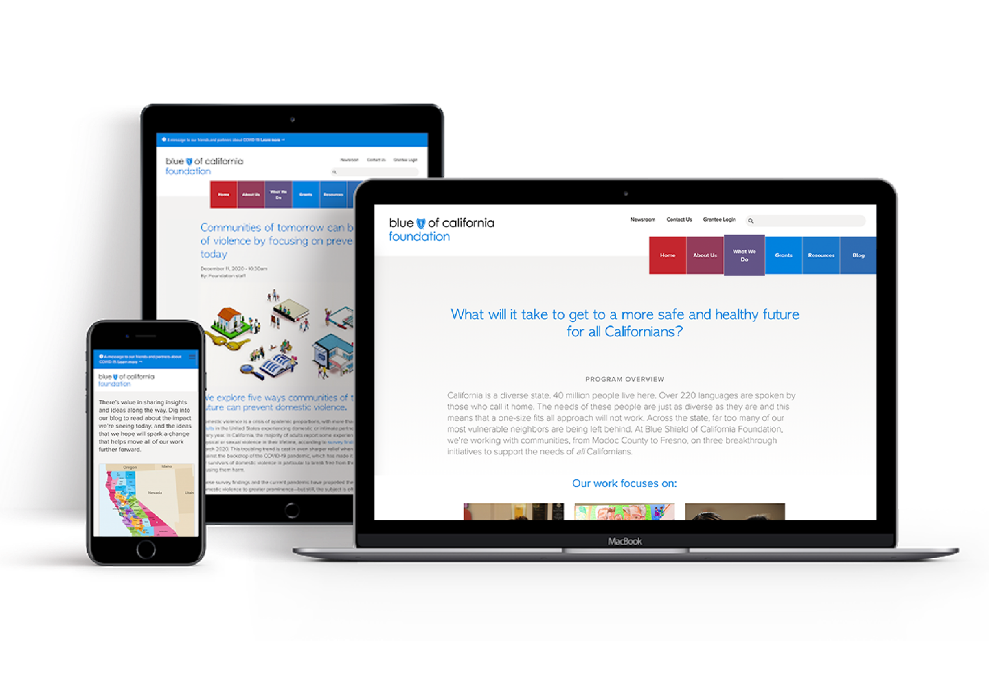
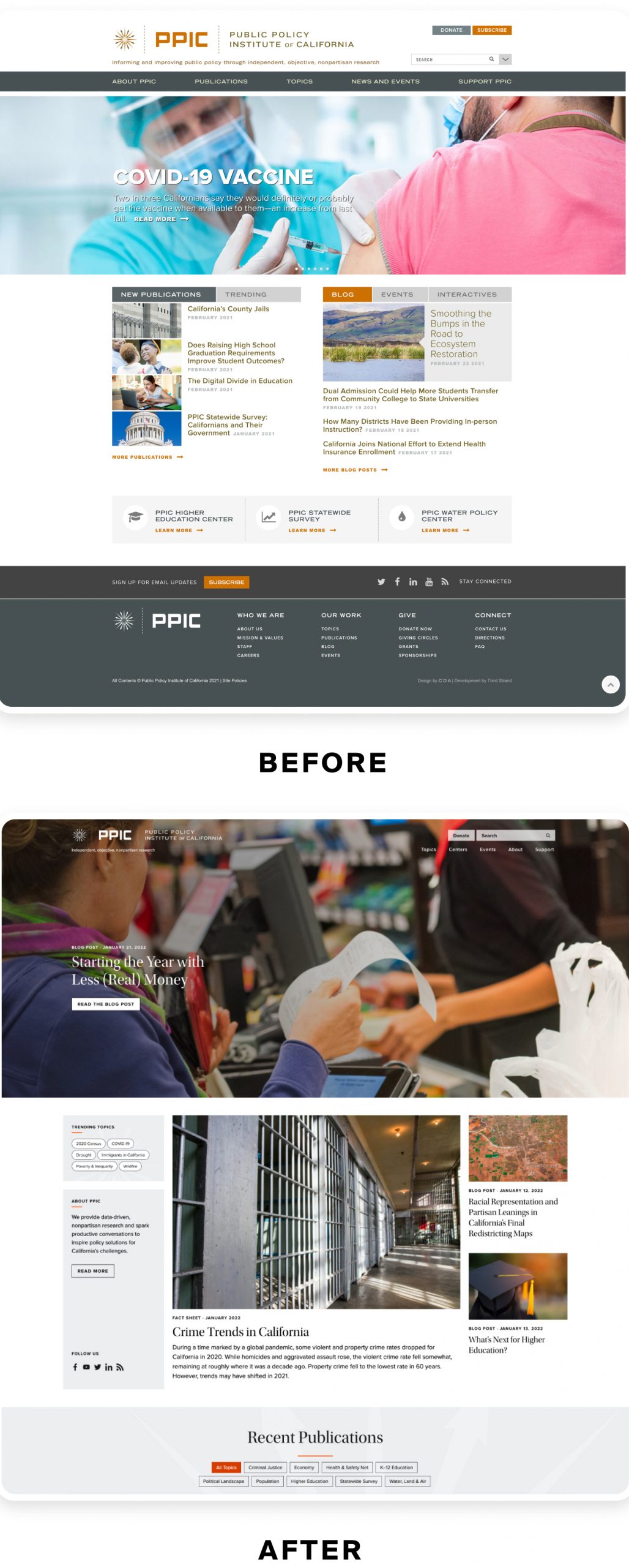
We redesigned PPIC’s website and technology stack from the ground up, making its data more accessible for audiences and its digital tools more intuitive for its staff.
The
Solution
- Audience research to inform site design
- Website design and development to prioritize user experience and seamless authoring
- New technology stack for the website
THE RESULTS IN NUMBERS
reduction in load time
increase in daily page views
Redefining the value of the policy think tank
It’s hard to quantify the value of the information that courses through the Public Policy Institute of California. At a time of partisan rhetoric, consuming news through headlines, and clipped social media posts, PPIC is relentless in researching and analyzing what’s truly going on in California. If you want to know where Californians stand on any issue—education, the environment, crime—PPIC has you covered. If you want to know just about any fact about California—that the majority of public school students are considered “high need”; that its prison population dropped the lowest of any state during the COVID-19 pandemic—you can rely on PPIC for accurate information.
But does this information become less valuable if it’s hard for people to access it? What’s the value of a think tank like PPIC if the public has to wade through a complex website and long PDF reports to find out what’s really going on in California?
Those were the big questions we faced when we partnered with PPIC to redesign its website from top to bottom. More than a design or development exercise, we saw it as an exercise in making it easier for people to access high-quality information, at a time when that very thing is harder and harder to come by.
Expanding who gets value from PPIC
The first thing we noticed is that PPIC is really beloved among policymakers and academics. As in, those groups wait on pins and needles for PPIC to drop its latest survey, so they can dive in and analyze it and make recommendations for how to improve the state. But the people that actually would benefit from those recommendations—teachers or caregivers or migrant workers, say—don’t know much about PPIC. They aren’t trained in data analysis and they aren’t used to reading lengthy research reports. While PPIC was informing the changemakers, they weren’t necessarily informing the public.
PPIC knew that a website redesign alone wasn’t going to make teachers or migrant workers familiar with PPIC. But they wanted a website that felt welcoming to those audiences. Not just from a UX perspective, but from a mission perspective. One of PPIC’s core values is accessibility, so it needed to offer an intuitive experience that makes its resources easier to find, engage with, and share.
Building for accessibility and sustainability
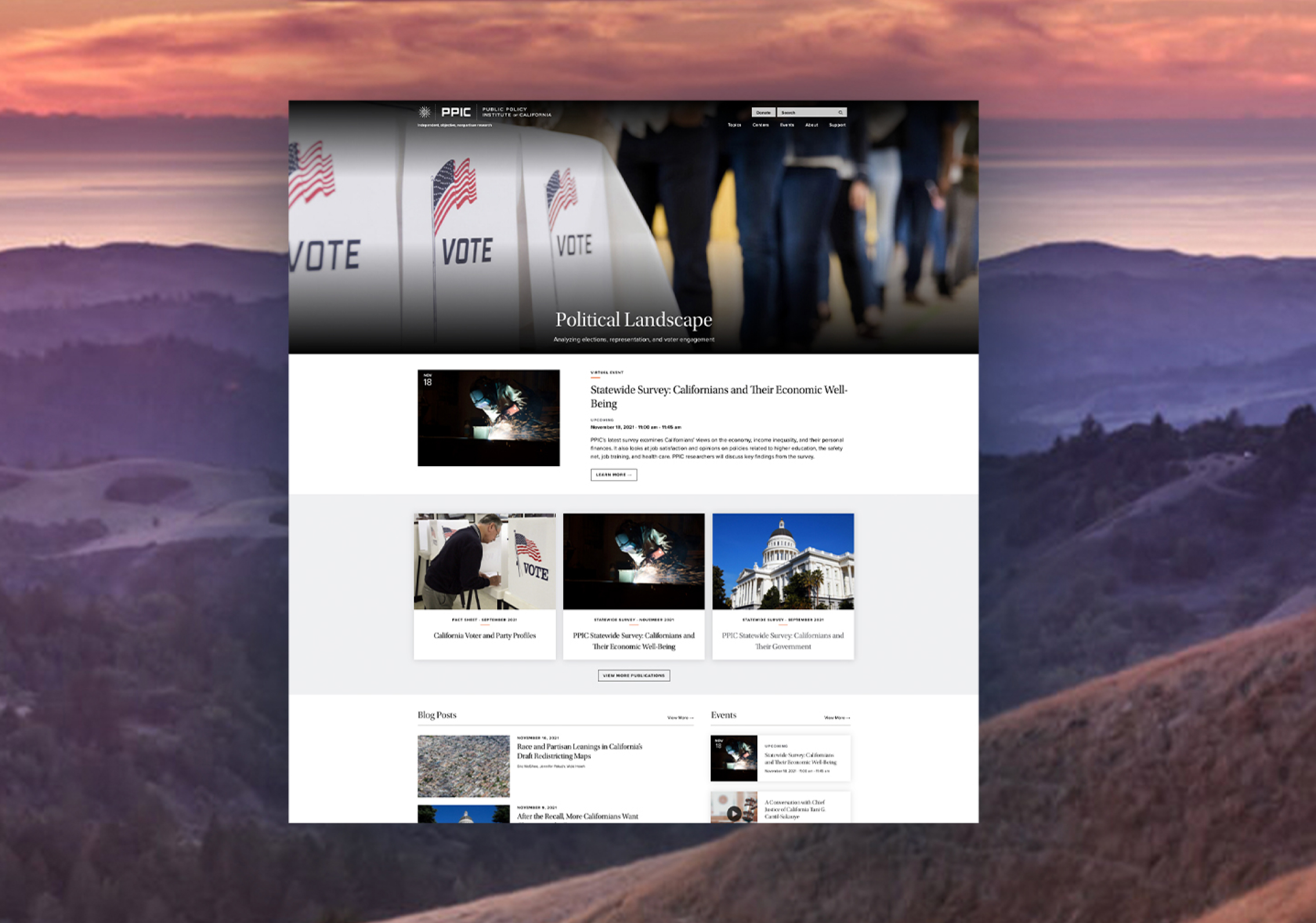
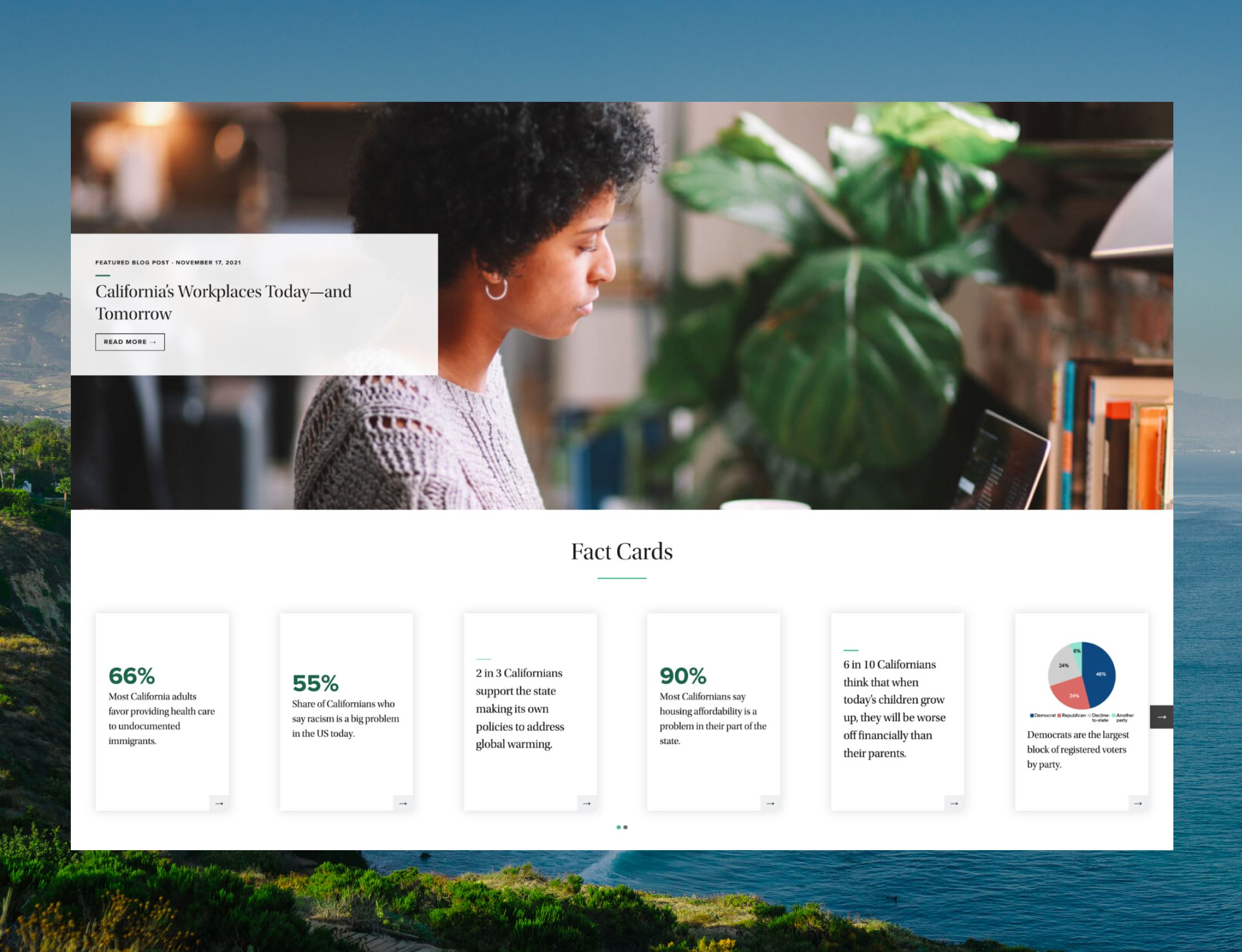
Through our audience research, people told us they look for information based on topics (education, health, environment, etc.) instead of formats (report, fact sheet, etc.). So we organized the site based on the former, whereas the previous version was organized by the latter. Given the deep wealth of information that PPIC offers, audiences told us they often rely on search to find what they need. So we overhauled the search feature to get better results, faster. We also streamlined the site’s information architecture and developed a modular design system with content formats such as shareable fact cards highlighting insights from PPIC’s research. We brought the site into compliance with WCAG 2.0 AA accessibility standards. And we made the site more accessible to PPIC’s own employees by building an intuitive authoring experience that allows site administrators to spend less time on basic site maintenance and more time on user priorities.
We also didn’t want PPIC to have to do this all over again in a couple years. So we decided to rebuild PPIC’s site from the ground up with a new technology stack that makes it easier for PPIC to add features over time. Otherwise, new site features would make it harder to update the site.
In the end, we didn’t just create a website for a think tank. We created a place to help people understand what’s happening in California. That’s what PPIC has done for 30 years. Now more people can benefit from it.
The new website looks great! Thanks to everyone on the team for their individual and collective contributions. This is a remarkable accomplishment for our 2025 strategic plan in ‘increasing accessibility of our work.’ It is a giant step forward for PPIC.


